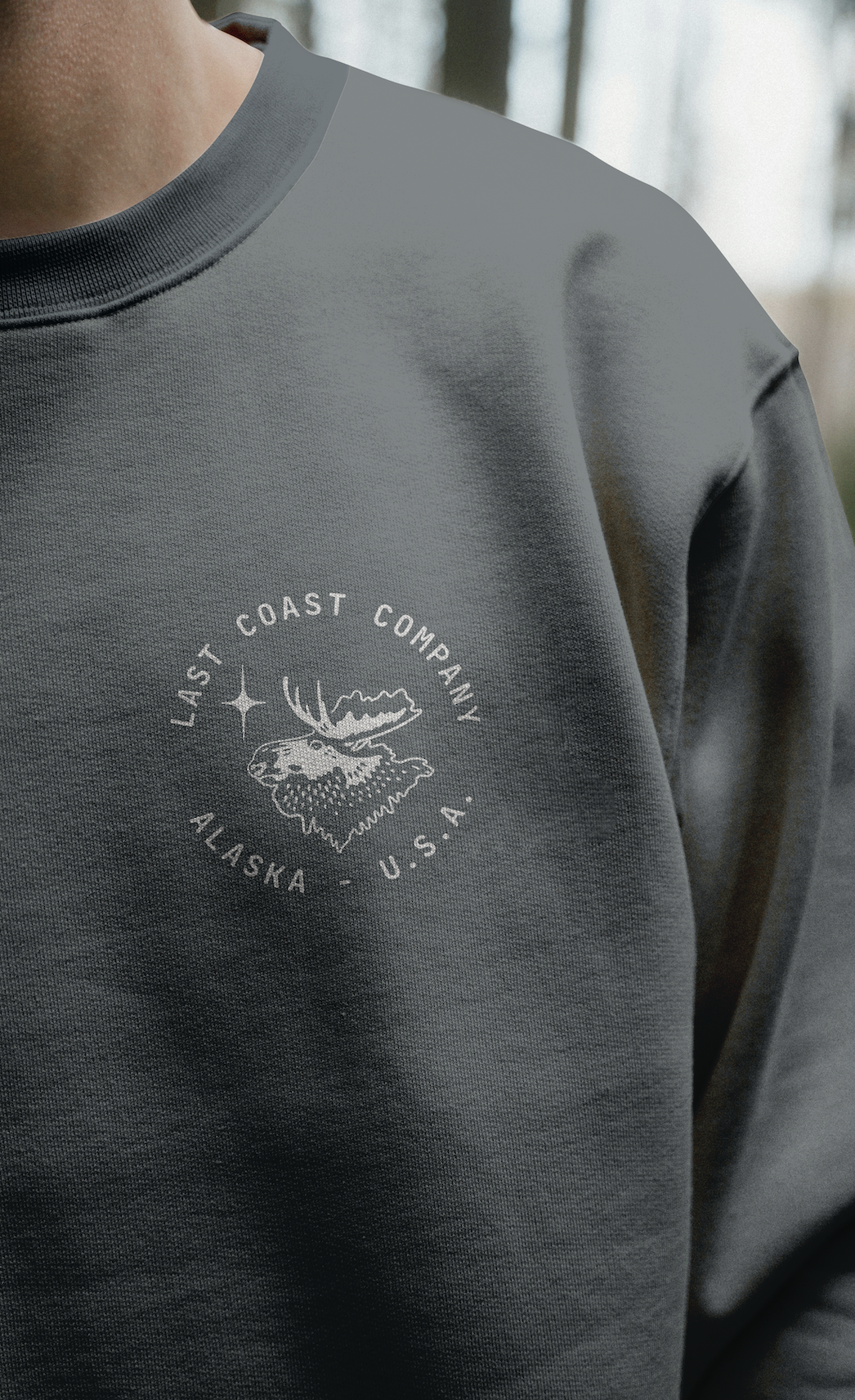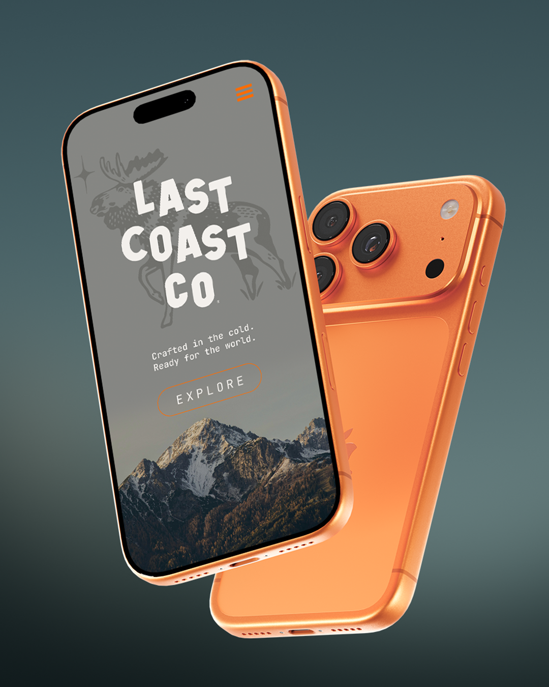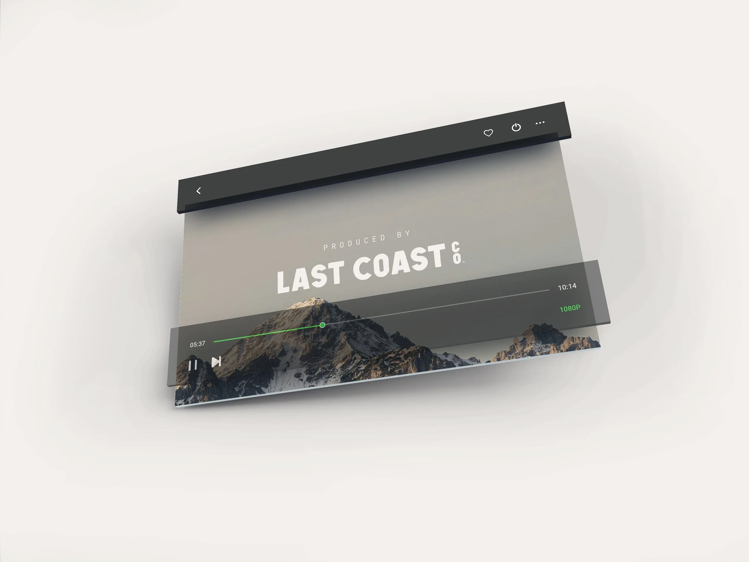
Last Coast Co. is a photography and video production brand shaped by the rugged beauty and quiet resilience of the North. These standards exist to ensure the identity remains consistent, recognizable, and true to the spirit of Alaska’s last frontier.
Every element — from the wordmark to the moose iconography — is designed to balance craft, clarity, and a deep sense of place. This guide outlines how to use each component properly so the brand always communicates confidence, authenticity, and a timeless outdoor character.
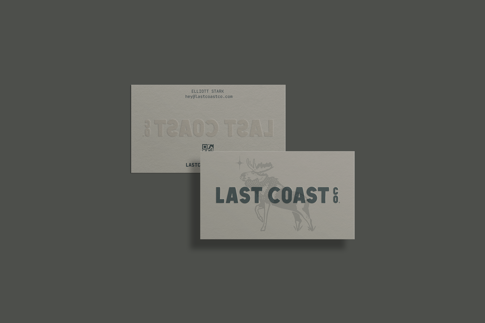
Wordmark
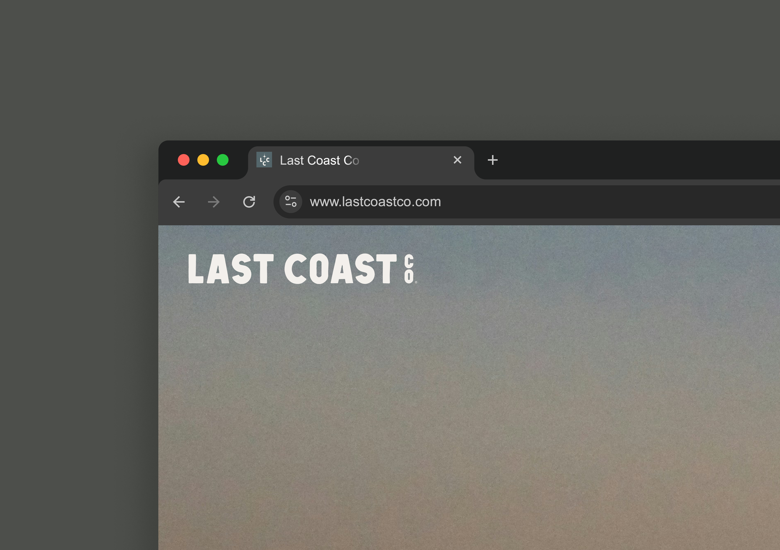
The Last Coast Co. wordmark is the primary expression of the brand’s identity. Designed with clean geometry and a structured presence, it reflects stability, reliability, and modern craftsmanship.

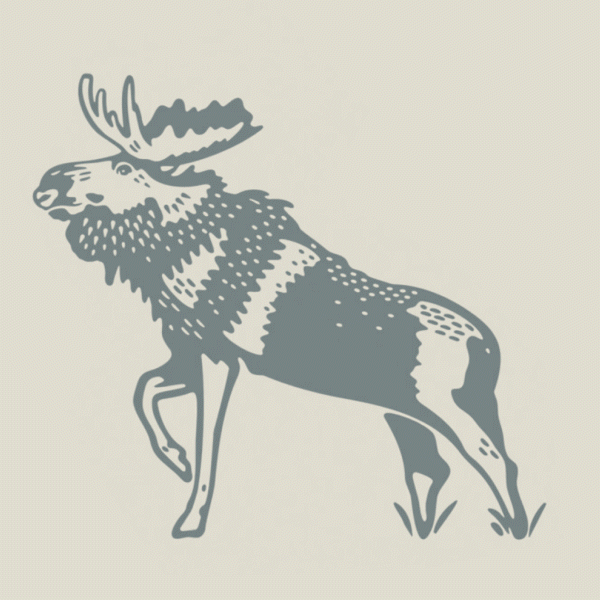
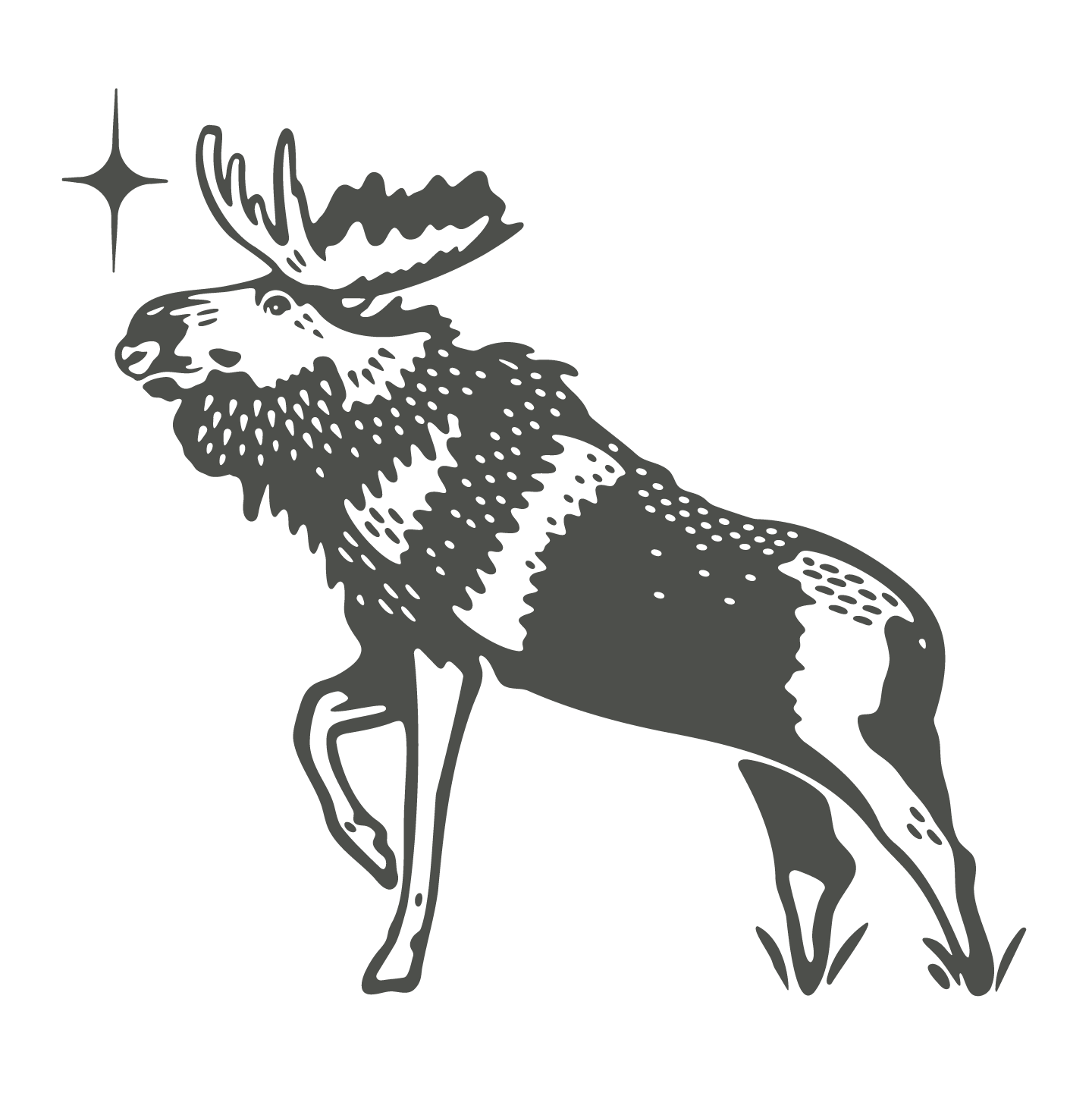
Moose
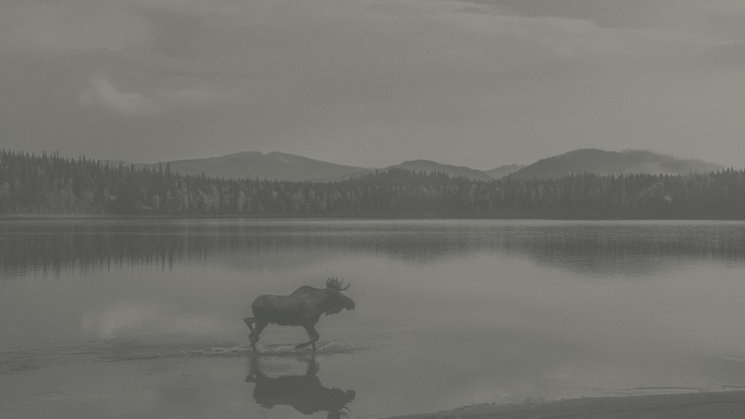
The Moose Mark is the core symbol of Last Coast Co.—a nod to the wildlife and vast landscapes that define Alaska. It evokes strength, independence, and a sense of exploration.

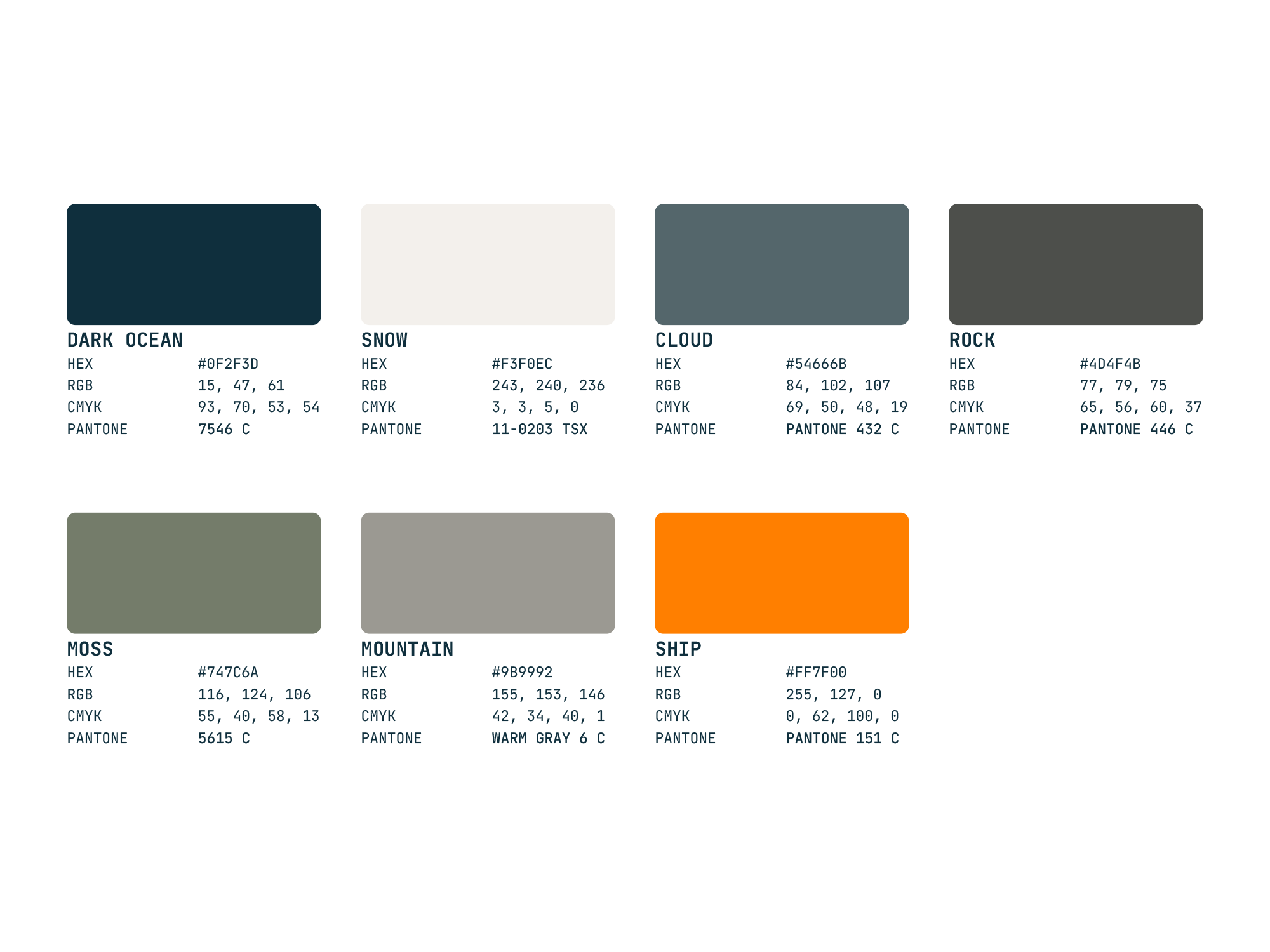
Color
The Last Coast Co. palette draws directly from Alaska’s terrain — ship paint, rocky coastlines, mossy forests, icy horizons, and snow-covered ground.
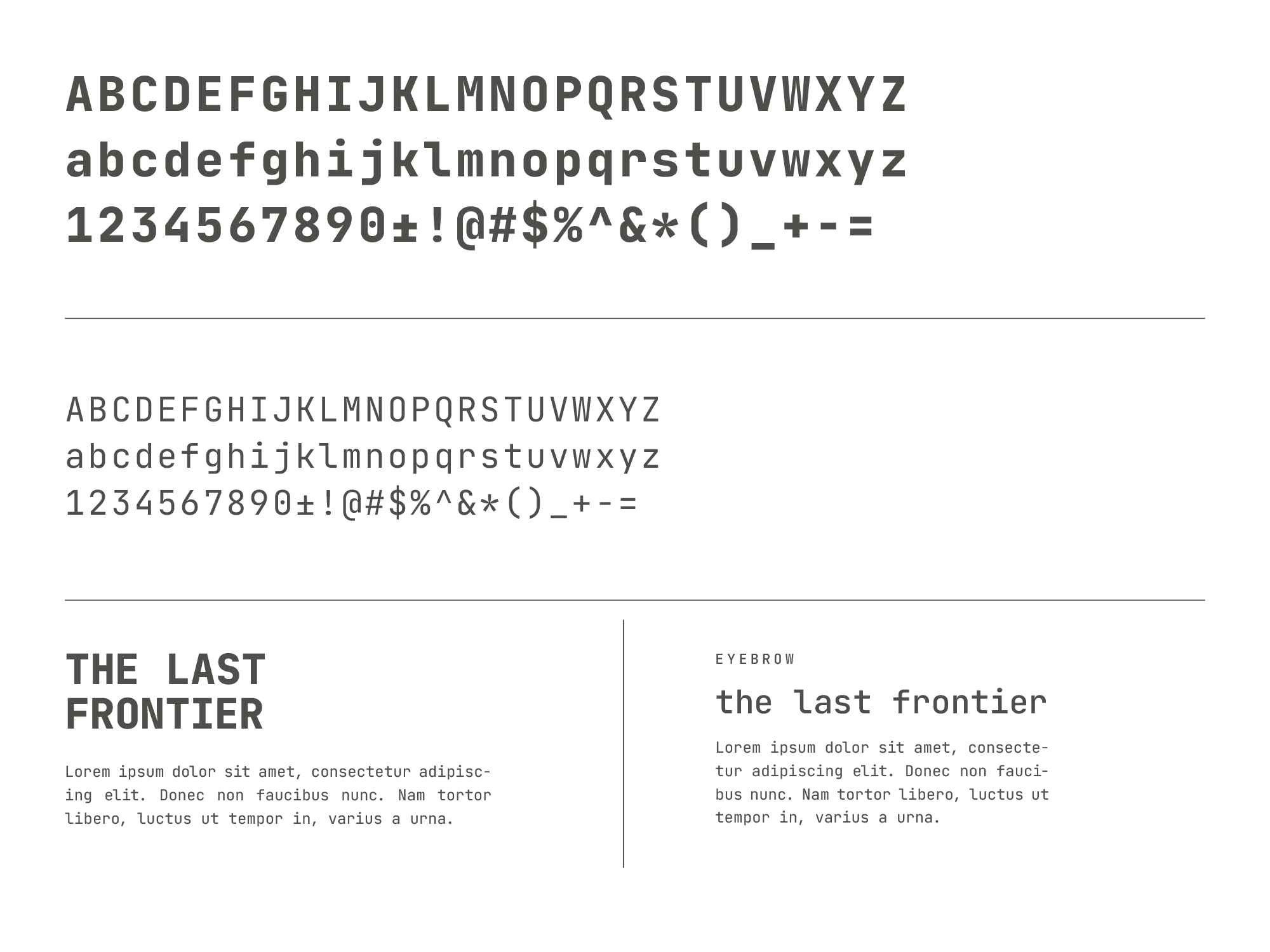
Typography - Jetbrains Mono
Typography plays a crucial role in establishing Last Coast Co.’s functional, modern, and utilitarian tone.